


/* Namespace */
.dbx *{box-sizing:border-box}
.dbx .section{margin:0 0 40px}
.dbx .section-title{
font-size:1.5rem;font-weight:600;margin:0 0 12px;
padding-bottom:8px;border-bottom:1px solid #e5e5e5;
letter-spacing:.02em;text-transform:uppercase
}
.dbx .description{font-size:1rem;line-height:1.7;margin:0 0 18px}
.dbx .rule{border-top:1px solid #e5e5e5;margin:0 0 14px}
/* LI with top/bottom border */
.dbx .lined{list-style:none;margin:0;padding:0}
.dbx .lined li{padding:10px 0;border-top:1px solid #f0f0f0;border-bottom:1px solid #f0f0f0}
/* Cards (What’s Included) – 4 columns responsive */
.dbx .cards{
display:grid;grid-template-columns:repeat(4, minmax(0,1fr));
gap:22px;margin-top:6px
}
.dbx .card{
border:1px solid #eee;border-radius:12px;background:#fff;
box-shadow:0 4px 8px rgba(0,0,0,.08);padding:14px;text-align:center;
height:100%;display:flex;flex-direction:column;
transition:transform .2s ease, box-shadow .2s ease;
}
.dbx .card:hover,.dbx .card:active{transform:translateY(-4px);box-shadow:0 10px 18px rgba(0,0,0,.14)}
.dbx .card img{width:100%;height:150px;object-fit:cover;border-radius:8px;margin:0 0 10px}
.dbx .card h4{margin:6px 0 2px;font-weight:700;color:#0b6e8a;text-transform:uppercase;font-size:1rem}
.dbx .card p{margin:0;color:#475569;font-size:.95rem}
/* Specs in lines (no table) */
.dbx .specs{display:grid;gap:0}
.dbx .spec-item{display:grid;grid-template-columns:1fr auto;align-items:center;padding:12px 0;border-bottom:1px solid #f0f0f0}
.dbx .spec-item .label{color:#555;font-weight:500;padding-right:12px;word-break:break-word}
.dbx .spec-item .value{color:#111;text-align:right;word-break:break-word}
/* Media blocks (Materials / Finishes / Colors) */
.dbx .media-grid{display:grid;gap:18px}
.dbx .media-grid.cols-2{grid-template-columns:repeat(2,minmax(0,1fr))}
.dbx .media-grid.cols-3{grid-template-columns:repeat(3,minmax(0,1fr))}
.dbx .media-tile{
border:1px solid #eee;border-radius:12px;overflow:hidden;background:#fff;
transition:transform .2s ease, box-shadow .2s ease;
}
.dbx .media-tile:hover,.dbx .media-tile:active{transform:translateY(-4px);box-shadow:0 10px 18px rgba(0,0,0,.14)}
.dbx .media-tile img{width:100%;height:auto;display:block}
.dbx .media-tile .cap{padding:10px 12px;text-align:center}
.dbx .media-tile .cap h5{margin:0 0 4px;font-size:1rem;color:#0b6e8a;text-transform:uppercase}
.dbx .media-tile .cap p{margin:0;color:#475569;font-size:.95rem}
/* Mix & Match – tiles */
.dbx .mix-grid{display:grid;grid-template-columns:repeat(4,minmax(0,1fr));gap:18px}
.dbx .mix-tile{
border:1px solid #eee;border-radius:12px;overflow:hidden;background:#fff;
display:flex;flex-direction:column;
transition:transform .2s ease, box-shadow .2s ease;
}
.dbx .mix-tile:hover,.dbx .mix-tile:active{transform:translateY(-4px);box-shadow:0 10px 18px rgba(0,0,0,.14)}
.dbx .mix-tile .imgwrap{aspect-ratio:4/3;width:100%;overflow:hidden}
.dbx .mix-tile img{width:100%;height:100%;object-fit:cover;display:block;transition:transform .25s ease}
.dbx .mix-tile:hover img{transform:scale(1.03)}
.dbx .mix-tile .cap{padding:10px 12px;text-align:center;font-weight:600;color:#0b6e8a;text-transform:uppercase}
/* YouTube responsive (full width + radius 8px) */
.dbx .video{position:relative;width:100%;padding-top:56.25%;border-radius:8px;overflow:hidden;margin:20px 0}
.dbx .video iframe{position:absolute;inset:0;width:100%;height:100%;border:0;border-radius:8px}
/* Breakpoints */
@media (max-width:1024px){
.dbx .cards{grid-template-columns:repeat(3, minmax(0,1fr));}
.dbx .mix-grid{grid-template-columns:repeat(3,minmax(0,1fr))}
}
@media (max-width:768px){
.dbx .section-title{font-size:1.25rem}
.dbx .card img{height:120px}
.dbx .cards{grid-template-columns:repeat(2, minmax(0,1fr));}
.dbx .media-grid.cols-3{grid-template-columns:repeat(2,minmax(0,1fr))}
.dbx .media-grid.cols-2{grid-template-columns:1fr}
.dbx .mix-grid{grid-template-columns:repeat(2,minmax(0,1fr))}
}
@media (max-width:480px){
.dbx .section-title{font-size:1.15rem}
.dbx .card img{height:100px}
.dbx .cards{grid-template-columns:1fr;}
.dbx .mix-grid{grid-template-columns:1fr}
}
Description
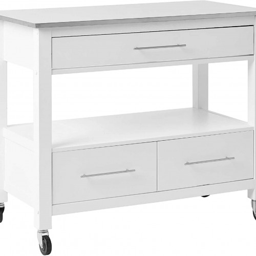
Built from premium powder-coated aluminum cabinetry and designed for ceramic cookers, the 6.37-Ft Outdoor Kitchen Cart (Model 7100-002007) gives your large kamado grill a mobile, fully assembled outdoor workstation. It features a Silver Vein aluminum countertop, shaker-style doors, and textured Grey Glimmer aluminum cabinetry.
Ready out of the box with 2 stationary and 2 swivel locking casters, a right-side towel-bar handle, plus interior storage with a left & right internal drawer and one adjustable shelf. Ceramic grill not included.
Dimensions
Overall Width: 77″ (Approx. 6.375 ft)
- Overall Depth: 25″
- Overall Height: 32″
- Grill Opening: Fits Large ceramic kamados (sold separately)
- Construction: Powder-coated aluminum cabinet with Silver Vein top
- Mobility: 2 fixed casters + 2 swivel locking casters
- Storage: Left & right internal drawer + 1 adjustable shelf
What’s Included
 Aluminum Cart
Coastal-series, powder-coated cabinetry.
 Silver Vein Top
Durable aluminum work surface.
 Shaker Doors
Clean look with weather-resistant design.
 Locking Casters
2 fixed + 2 swivel locking wheels.
 Towel Bar Handle
Right-hand stainless handle.
 Interior Storage
Left & right drawer + 1 shelf.
 Grey Glimmer Finish
Textured aluminum cabinetry.
 Manuals & Guides
Challenger documentation.
Specifications
Series Available
 Coastal Cabinetry
Powder-coated aluminum construction.
 Ceramic Grill Ready
Built for Large kamado cookers.
 Silver Vein Top
Durable aluminum work surface.
Cleaning & Maintenance
Wipe aluminum cabinetry and stainless hardware with mild soap and warm water; dry with a soft cloth.
- Avoid abrasive pads or harsh chemicals (including chlorine/bleach).
- Periodically check and tighten caster hardware; lock wheels when parked.
- Use an appropriate cover when not in use.
Be the first to review “Challenger Designs 6 3/8-Ft Outdoor Kitchen Cart for Ceramic Grills”
Related products


HomeRoots

HomeRoots


Reviews
There are no reviews yet.